Day one of a 20,000-person startup
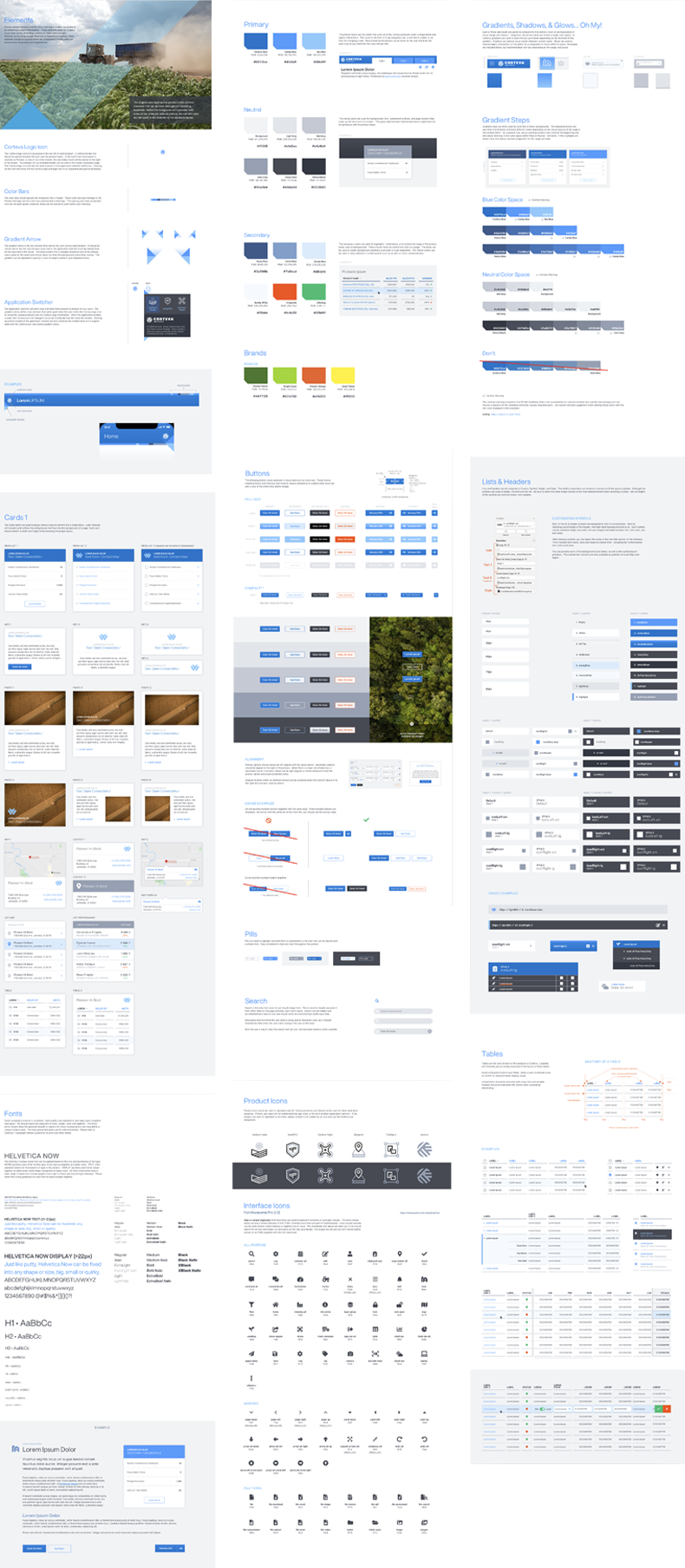
Corteva Agriscience launched in 2019 as the result of DowDuPont's agriculture spinoff. At launch, the brand was defined by a logo, a print color palette, stock photography, and a single corporate font.
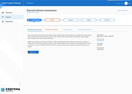
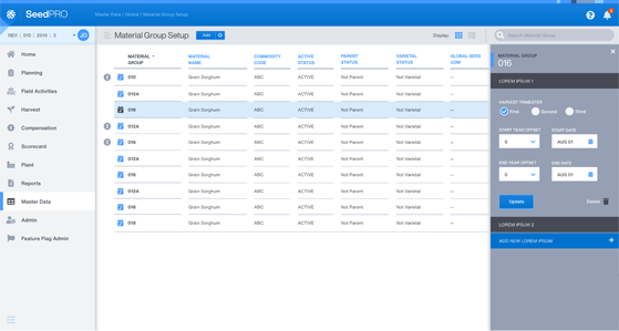
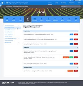
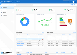
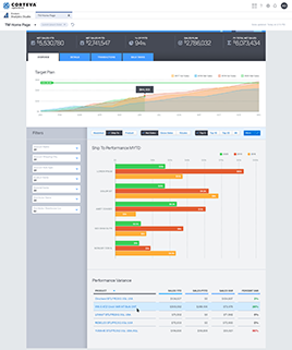
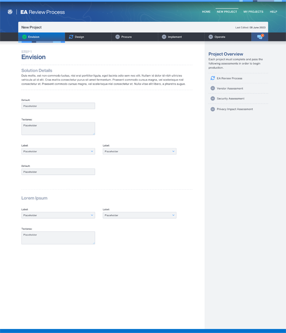
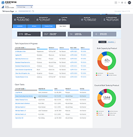
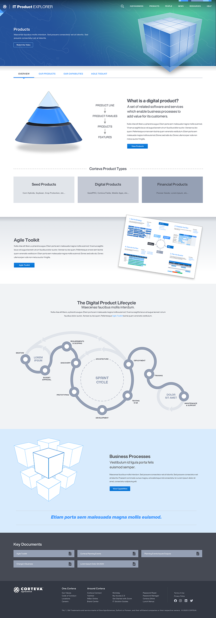
Internally, more than 600 digital products with GUIs were inherited from legacy Dow and DuPont systems and sub-brands — each with its own visual language, navigation, and brand interpretation. There was an urgent need for a unified user-centric design system that felt distinctly Corteva and consolidated interaction patterns and expectations.
Top-down brand, bottom-up components
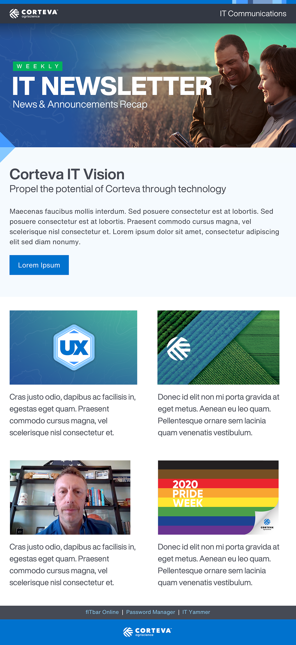
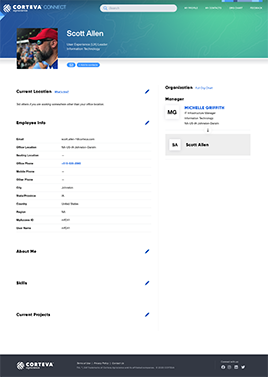
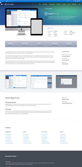
We worked in parallel: a brand track that expanded the limited style guide with additional colors, fonts, illustration, and motion principles; and a component track that audited top-performing legacy products to identify the patterns we could lift, refine, and standardize.
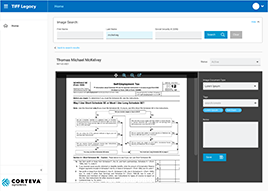
Components were intentionally designed to coexist with legacy interfaces during transition — reducing the disruption to in-flight projects and the inevitable political friction of "redesigning everything overnight."
One Corteva, finally
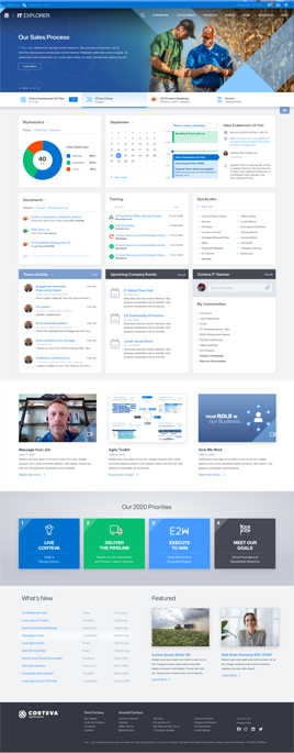
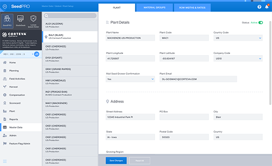
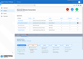
The design system and brand updates were utilized implemented across 100+ products and integrated marketing teams and resulted in a reduction in roadmap timelines, sprint cycles, and annual budgets. The design system was also used as a catalyst to bring product discovery in-house due to the ability to rapidly prototype future products, generating additional cost savings.
The design system continues to grow and evolve as new platforms and products are added - such as SalesForce Lightning and Microsoft PowerApps.