The IRL, CMYK world is becoming a lost discipline.
Most designers working today have never set up a bleed, specified a varnish, watched a press proof come off the line, or sweated a die-cut that has to register within a sixteenth of an inch. The tools have moved entirely to screen, and the assumption that "we can fix it in the next deploy" has trained a generation out of the precision that physical creative work demands.
That gap matters because physical creative is still where brands earn the moments customers actually remember — the package on the shelf, the poster that stops you in the hallway, the trade show booth that pulls you in from across the floor. Done well, these pieces do something a screen can't: they let people touch the brand. Done with a Canva template or an AI-generated layout, they flatten the brand into the same beige soup as everyone else's.
Across my career, I've been the person clients call when the deliverable has to physically exist — and has to work the first time, because there is no budget for a second time.
Design the full sensory experience, not just the layout.
Print and physical work taught me to think past the artboard. Every project starts with the questions that don't apply to web work: How does this feel in the hand? How does light hit it at 9 AM versus 4 PM? What does the varnish do at a glancing angle? What weight of paper carries the right impression — literally and figuratively? How does the die-cut reveal what's underneath? My career started at a magazine company, where the discipline of bleeds, overlays, color separations, and paper specs became muscle memory.
The work has spanned the full range of physical media:
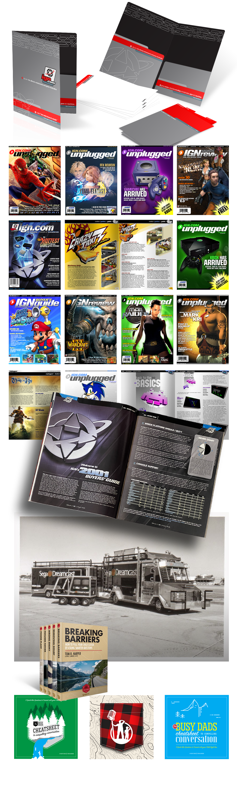
- Magazine production at speed — designing dozens of IGN print magazines on compressed days-not-months timelines, with the typography and layout discipline holding up under deadline pressure.
- Vehicle and environmental wraps — designed the wraps for the launch roadshow "Mobile Assault Tour" of the Dreamcast game system, where the design had to read at highway speed and on a parked vehicle drawing a crowd.
- Trade show environments — multiple full booth designs across hardware panels, fabric, counters, lighting, demo reels, and signage — each booth telling a single coherent story about the brand from twenty feet away through the close-up read.
- Posters across categories — oversaw and contributed to dozens of posters spanning movies, AAA games, events, and corporate education.
- Print collateral — countless book covers, brochures, and one-sheets where the trim, fold, and stock did as much work as the layout.
- Parade float sculpture — award-winning three-dimensional creative built to be seen from every angle, in motion, by thousands of people at once.
Underneath all of it: working with print shops to negotiate runs and efficiencies, and checking text and images obsessively before release — because in this medium, a typo costs a print run, not a hotfix.
Work that survived the press, the show floor, and the parade route — and shaped how I lead creative everywhere else.
Every piece in my body of work shipped, on time (mostly), in physical form, in front of real audiences. The Dreamcast roadshow wraps drove a national launch tour. The IGN magazines released at a cadence the rest of the industry couldn't match. The trade show environments pulled traffic and demonstrated products to live audiences who walked away remembering the brand. The parade float sculpture took home awards (and also triggered an investigation - ask me about it some time).
The compounding outcome is what physical work taught me about creative leadership. Designing for print, packaging, and environments forces you to see a product through every possible lens — at distance, in hand, under different light, alongside competitors on a shelf — and to make the brand hold together across all of them. That perspective travels: it shows up in how I shape marketing campaigns, in how I direct other designers, and in how I find the efficiencies and trade-offs that protect the original impact when budgets get real.
It also shows up in what I refuse to ship. Physical creative for marketing is increasingly handed to Canva and AI-generated templates, and the result is the same beige output across every brand using the same tools. Elegance, presence, and uniqueness still come from the same place they always did — from someone who has actually held the work in their hands, watched the light hit it, and cared enough to get it right before the press started running.